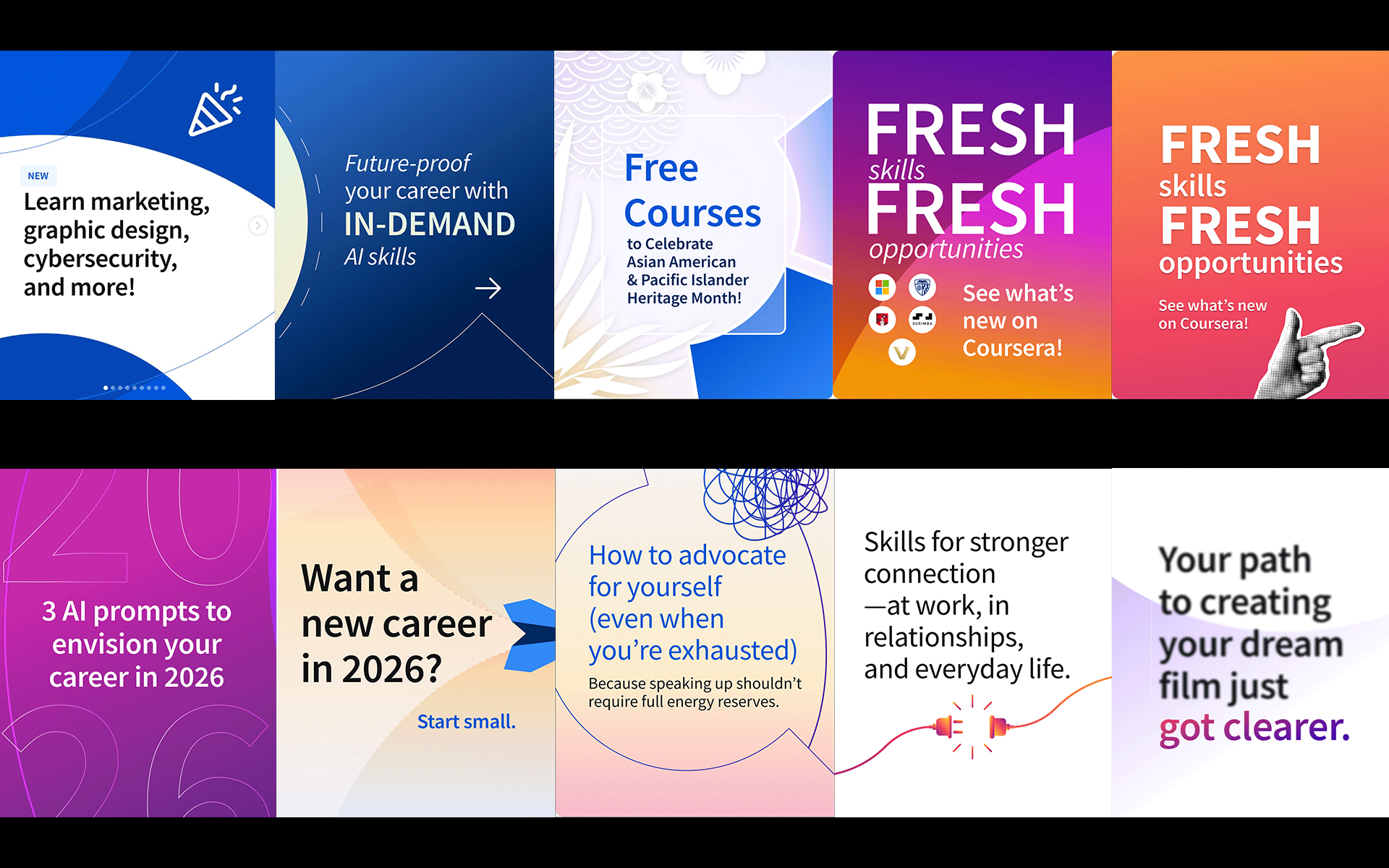
This project focused on research and development around how the initial card of a social media post is perceived and how visual tone influences viewer engagement. The objective was to rethink Coursera’s social entry point by moving away from heavier, corporate feeling compositions toward a lighter, more contemporary visual language that could invite curiosity and accessibility.
Through visual research and iterative experimentation, I explored the use of lighter color palettes, reduced visual weight, and playful illustrative elements. These choices were intentional, designed to soften first impressions and create a more welcoming and human centered presence within fast scrolling social environments. By refining contrast, composition, and color balance, the entry cards were reimagined as invitations rather than announcements.
This work positions social media design as a site of visual research, where small shifts in tone and composition can significantly alter how information is received. By treating the first frame as a critical moment of engagement, the project demonstrates how thoughtful design decisions can expand a brand’s expressive range while maintaining clarity, recognition, and coherence across platforms.