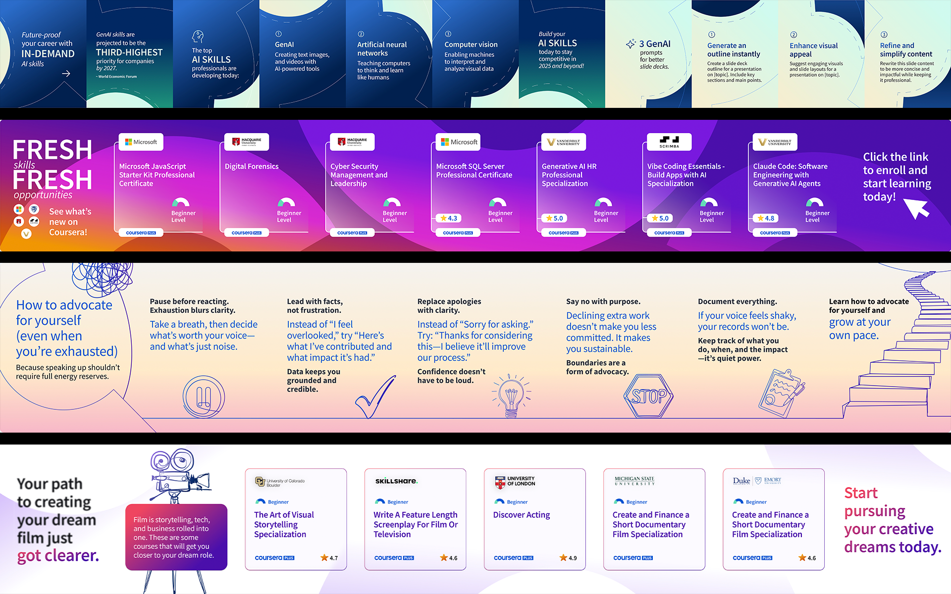
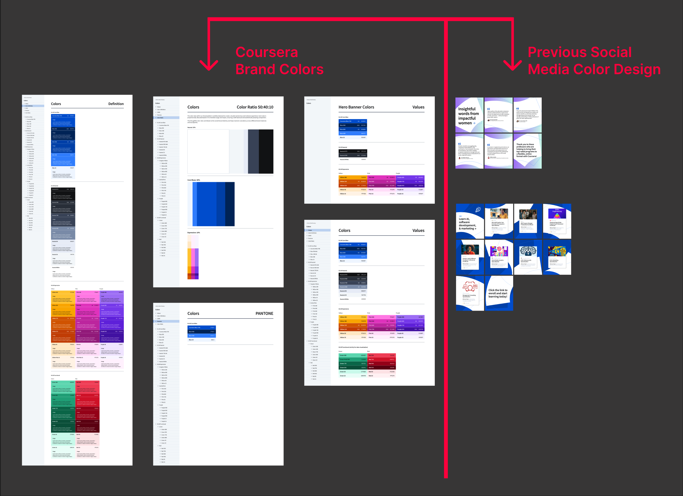
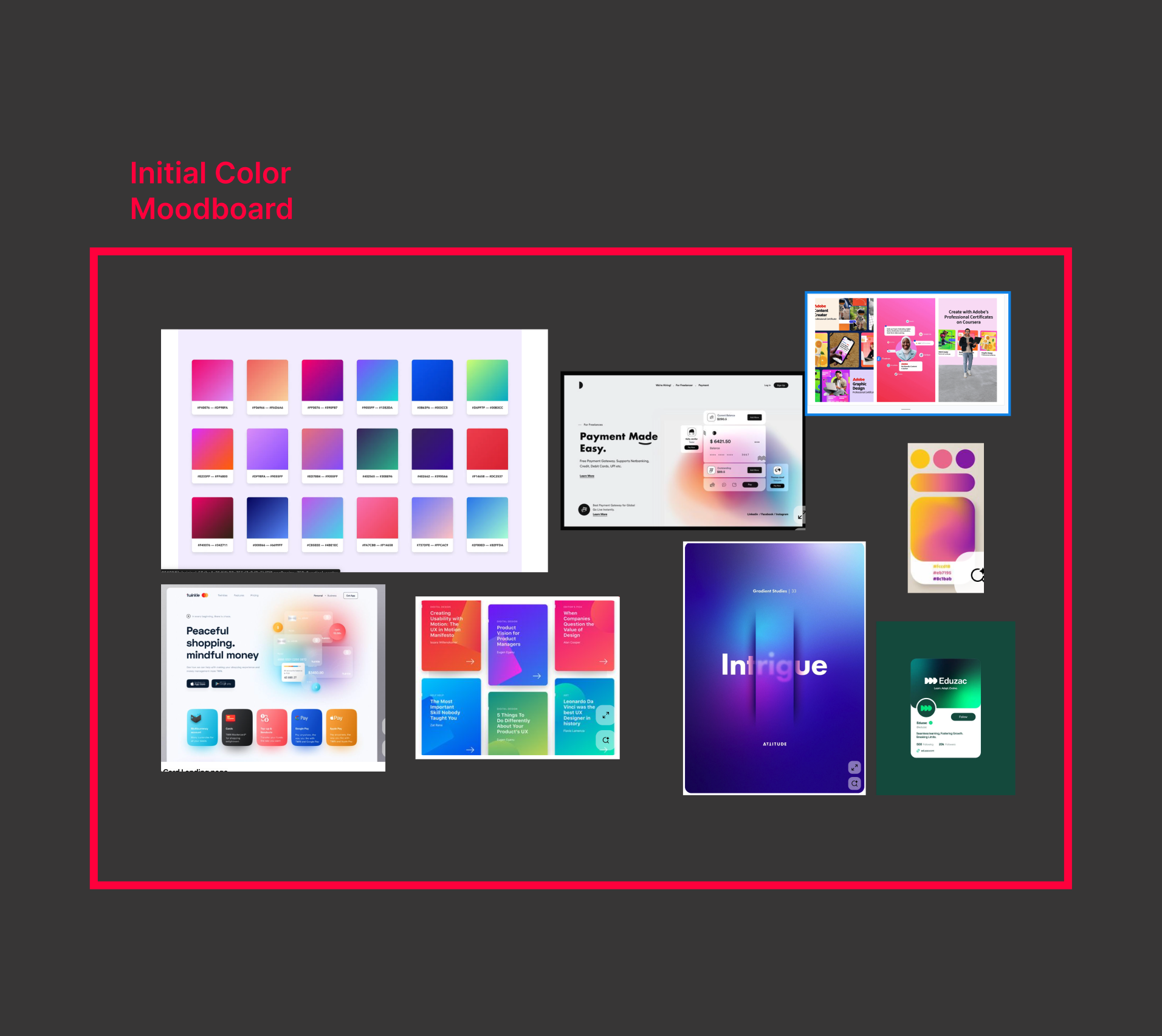
This project documents an ongoing exploration of color and composition within Coursera’s organic social and acquisition channels. The goal was to evolve Coursera’s visual language toward a more contemporary and expressive direction while remaining grounded in its established brand identity. While Coursera blue served as a constant anchor, I explored expanded use of secondary colors and gradients drawn from the broader brand palette.
Through research and iterative experimentation, I examined how pairing cooler blues with warmer and jewel toned accents could soften an overly corporate visual tone while maintaining clarity and authority. Working closely with social media managers and copywriters, I tested these color relationships across multiple compositions, treating color and layout as a flexible system rather than a fixed formula. This work positions color and composition as narrative tools that shape perception, accessibility, and engagement within social media environments.